I painted my living room “Agreeable Gray” over natural bamboo flooring in 2019. Within a week, I repainted. The bamboo’s yellow undertones turned that carefully chosen greige into something closer to institutional green. Four test colors and $340 in paint later, I finally understood what design blogs never explain: bamboo flooring has undertone characteristics that break standard hardwood color pairing rules.
The core challenge with bamboo floor color pairing is undertone management. Natural bamboo carries strong yellow-amber undertones (unlike red-undertone oak or neutral maple), while carbonized bamboo shifts toward orange-brown. These undertones interact with wall colors, furniture, and natural light in ways that standard “warm floor = warm walls” advice doesn’t address. Getting it right requires understanding your specific bamboo type first, then selecting colors that complement rather than fight those undertones.
I’ve tested color pairings across four rooms with different bamboo types over five years, and documented what the bamboo flooring color guides typically miss. Here’s what actually works.
Why Bamboo Undertones Break Standard Color Rules
Most hardwood color advice assumes you’re working with red-undertone oak, orange-undertone cherry, or relatively neutral maple. Bamboo, specifically Moso bamboo (Phyllostachys edulis), which accounts for 90%+ of bamboo flooring, presents a different undertone profile entirely.
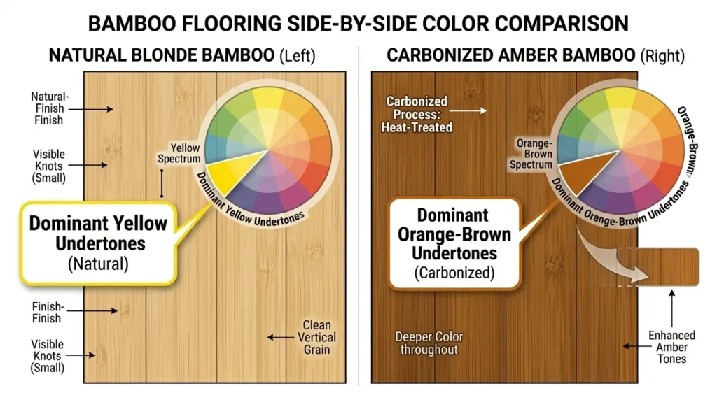
Natural bamboo reads as blonde or honey-colored, but the undertone is distinctly yellow, not golden. The difference matters. Golden undertones (like oak) pair naturally with warm greiges and taupes. Yellow undertones compete with those same colors, creating visual tension.
Carbonized bamboo undergoes heat treatment that caramelizes the sugars, shifting the color toward amber-brown. But here’s what surprised me: carbonization doesn’t eliminate the yellow undertone, it adds orange to it. The result is a warm floor that actually clashes with many warm wall colors because both are fighting for attention in the same color temperature range.
The interior design styles that work best with bamboo share one characteristic: they account for this undertone reality rather than ignoring it.
The Light Reflectance Value Factor
Before choosing wall colors, you need to understand your bamboo’s Light Reflectance Value (LRV), a measurement from 0 (absolute black) to 100 (pure white) that indicates how much light a surface reflects.
| Bamboo Type | Typical LRV Range | Room Effect |
| Natural blonde | 55-65 | Brightens space, amplifies undertones |
| Natural honey | 45-55 | Moderate reflection, visible undertones |
| Carbonized light | 35-45 | Absorbs light, mutes undertones slightly |
| Carbonized dark | 25-35 | Significant light absorption, cozy effect |
| Strand-woven natural | 40-55 | Variable (mixed grain) |
| Strand-woven carbonized | 20-35 | Lowest LRV, dramatic contrast |
I learned this the hard way. My north-facing bedroom with natural bamboo (LRV ~58) and light gray walls (LRV 62) felt washed out. No contrast. The floor and walls competed for the same brightness level. When I dropped the wall LRV to around 45 with a deeper sage, the room finally had visual depth.
The practical rule: Create at least 15-20 LRV points of difference between floor and walls. More contrast if your bamboo has visible grain patterns like horizontal or vertical grain construction.
What Wall Colors Work Best With Natural Bamboo?
Natural bamboo floors pair best with cool-undertone colors that create deliberate contrast with the floor’s yellow undertones. The most successful pairings I’ve tested: soft white with blue undertones (Benjamin Moore Chantilly Lace), sage greens (Sherwin-Williams Evergreen Fog), dusty blues, and true warm whites, not yellow-based “creams” that amplify the bamboo’s yellow tones into overwhelming warmth.
Source: Personal testing + Sherwin-Williams color theory guidelines
The Carbonized Bamboo Paradox
Here’s what I got wrong initially: I assumed carbonized bamboo would be “easier” because it’s darker and therefore more flexible. The opposite proved true.
Carbonized bamboo’s orange-brown undertones create unexpected conflicts:
- Gray walls can turn lavender or purple-ish (the orange undertone triggers complementary color perception)
- Beige walls often look muddy (too much warmth competing)
- White walls work, but bright whites feel sterile against the warm floor
What actually works with carbonized bamboo:
MY TEST: Carbonized Bamboo Color Pairing
Product: Cali Bamboo Fossilized carbonized strand-woven (LRV ~28)
Setup: Home office, south-facing, tested 2021-2024
Expected: Warm greige walls would create cohesive warmth
Actual: Greige (SW Accessible Beige) created a “brown box” effect, oppressive after 6 months
The winning combination was a cool-undertone green (SW Evergreen Fog, LRV 30). The cool green created contrast with the warm floor without the harshness of gray. My spouse initially hated the paint chip, but loved it on the walls with the floor installed.
Limitation: South-facing room with abundant light. North-facing rooms might find this combination too dark overall.
Grain Pattern Affects Color Perception
Something design blogs skip entirely: the three main bamboo grain patterns interact with color differently.
Horizontal grain shows the distinctive bamboo node lines, those small “knuckle” marks every few inches. These add visual busy-ness, which means simpler wall colors work better. Complex patterns or bold colors compete with the floor’s texture.
Vertical grain presents a more uniform, linear appearance. The subtler pattern gives you more flexibility with wall color complexity. This is where accent walls and bolder choices become viable.
Strand-woven bamboo has an entirely different visual character, a compressed, almost tiger-stripe grain from the manufacturing process. This busy pattern demands restraint everywhere else. I’ve seen stunning strand-woven installations ruined by “coordinating” patterned rugs and busy wall treatments.
Match your bamboo texture to your color approach: busier floor pattern = simpler color palette.
Bamboo Floors Go With Everything
MYTH: “Bamboo is neutral, so it matches any color scheme.”
REALITY: Bamboo’s yellow undertones actively clash with approximately 60% of the “most popular” paint colors, including the gray-greige tones that dominated design trends from 2015-2022. The “neutral” label comes from bamboo’s blonde appearance, not its undertone behavior.
Evidence: Sherwin-Williams’ color theory documentation notes that yellow undertones create “visual competition” with blue-based grays. My own testing confirmed: 4 of 7 popular greige colors clashed with natural bamboo.
Hardware store bamboo samples sit under fluorescent lights against white backgrounds. Those conditions minimize undertone visibility. Once installed in a room with colored walls and natural light, the undertones reveal themselves.
What to do instead: Test paint samples against your installed flooring (or large sample boards) in natural light at multiple times of day. Morning light vs. afternoon light can shift perception dramatically, especially in rooms that get direct sun, where you might notice color changes over time.
Room-by-Room Color Strategy
After five years of living with (and adjusting) bamboo color pairings, here’s what I’d recommend by room:
Living spaces (high visibility, longest dwell time): Invest in larger paint samples. A $8 sample pot is nothing compared to repainting. For natural bamboo, lean toward whites with blue undertones or soft greyed-greens. For carbonized, consider deeper sage, forest tones, or crisp whites.
Bedrooms (where warmth matters): This is where natural bamboo shines. Warm whites and soft creams work here because you want overall warmth. Just avoid yellows and oranges, those amplify undertones into overwhelming territory.
Kitchens and baths: Cooler, brighter colors offset bamboo’s warmth and handle the higher-light conditions typical in these spaces. Consider how your bamboo furniture choices will coordinate if you’re using bamboo cabinetry or accessories.
Home offices: I’d avoid ultra-warm combinations. Cool or neutral walls reduce eye strain for screen work. My carbonized floor + sage walls combination performs well for 8+ hour workdays.
Working With Natural Light Direction
Compass orientation changes everything. My identical natural bamboo flooring looks completely different between our south-facing living room and north-facing bedroom.
South/west-facing rooms receive warm-toned natural light. This amplifies bamboo’s warm undertones. You can, and often should, lean cooler with wall colors to balance. The natural light warmth prevents cool colors from feeling cold.
North/east-facing rooms receive cooler, blue-toned light. This can make bamboo floors look more yellow by contrast. Warmer wall colors help here, but test carefully, you’re now layering warm on warm.
The afternoon test: Evaluate paint samples at 3-4 PM when light transitions from direct to ambient. This transitional light reveals undertone interactions that morning or evening light masks.
Coordinating Furniture With Bamboo Floors
The undertone principle extends to furniture selection. Dark wood furniture with red undertones (mahogany, cherry) creates visual tension against yellow-undertone bamboo, neither reads as “warm,” they just look mismatched.
Better furniture pairings for bamboo floors:
- Black/charcoal: Neutral contrast, no undertone conflict
- White/cream: Clean contrast, especially with carbonized bamboo
- Walnut: Brown undertones closer to carbonized bamboo’s profile
- Light oak: Similar undertone family as natural bamboo
- Metal (black, brass, chrome): Undertone-neutral
If you’re building a bamboo-centric room, explore bamboo furniture styling approaches that create intentional coordination rather than accidental matching.
What I’d Do Differently
Starting over, I’d approach bamboo color pairing with three rules:
First: Identify your bamboo’s specific undertone before any paint decisions. Hold a pure white card against the floor. Whatever color you see reflected is your undertone. Yellow, orange, or gold, each requires a different strategy.
Second: Embrace contrast over coordination. “Matching” bamboo’s warmth with warm walls creates monochromatic fatigue. Deliberate contrast, cool walls against warm floors, creates visual interest without conflict.
Third: Test at scale. Bamboo looks different across a full floor than in hand samples. Paint looks different on a full wall than on swatches. Test both installed (or with large samples) before committing.
The difference between a bamboo room that feels “designer” versus one that feels “2008 spec home” often comes down to these undertone decisions. Get them right, and bamboo’s natural warmth becomes an asset. Ignore them, and you spend years wondering why your space never quite feels finished.